Overraskende begyndte disse stigninger imidlertid ikke, før nedlukningerne blev indført, men efter. Desuden begyndte de i næsten alle tilfælde umiddelbart efter. Ofte var dødelighedstallet på en nedadgående tendens, før de pludselig vendte kurs efter at nedlukningerne blev vedtaget.
Dette er en forbløffende konstatering. Men inden jeg diskuterer dets fulde import og stiller nogle spørgsmål til dem, der stadig forsvarer nytten af lockdowns, vil jeg præsentere de data, der beviser det.
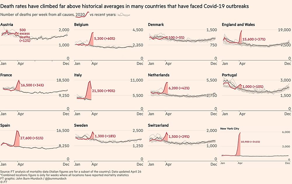
Her er en række diagrammer fra Financial Times, der viser den samlede dødelighed og 'dødsfald over det normale niveau' i 2020 for en række lande:
This is an astonishing finding. But before I discuss its full import, and pose some questions to those who still defend the utility of lockdowns, I want to present the data that proves it.
Kommentar: Delvist oversat af Sott.net fra Some Data-driven Questions About 'Excess Deaths' For Lockdown Apologists
Source.
Note: I removed the chart in the bottom right corner which represented "13 countries/cities combined" and replaced it with the FT chart for New York City.
As you can see, in every country there were significant increases in overall mortality beginning some time in February or March.
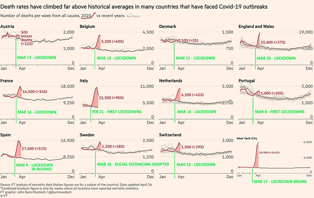
Now let's add the lockdown dates in green for each country:
You will notice that only after each country (or city) was locked down did the increases begin. Moreover, they began immediately, and in nearly every case, precipitously.
Now let's examine the data for a few of these countries and cities in greater detail.
Belgium
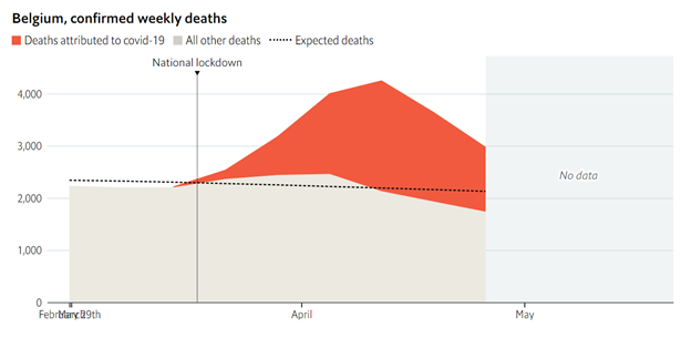
The Economist has published its own series of charts showing excess deaths in several countries. Here's its chart for Belgium:
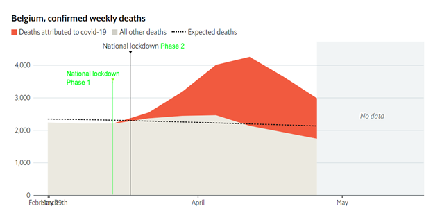
The national lockdown is shown to have occurred on March 18th. But that was only Phase 2 of the national lockdown. Phase 1, which included widespread business closures, began on March 13th.
Their chart, therefore, should really look like this:
Which shows no increase in mortality before the lockdown, and then an immediate and precipitous increase after it was imposed.
The Netherlands
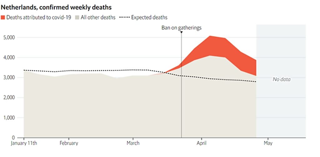
Here's The Economist's chart for the Netherlands:
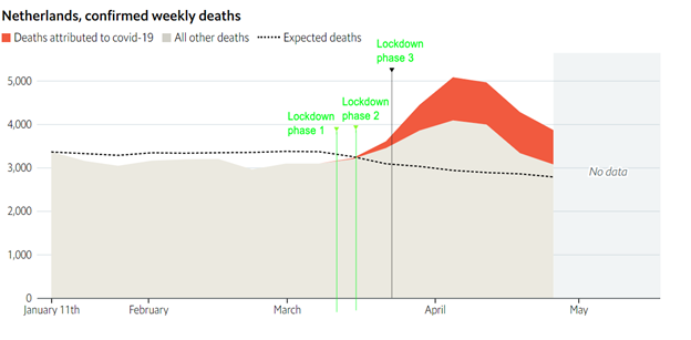
In a strange oversight, the lockdown that was declared on March 15 in that country is not indicated here. Moreover, the March 23rd "ban on public gatherings" shown in the chart was simply the bolstering of an already-existing ban on public gatherings that had been issued on March 12 (which was accompanied by the lockdown of nursing homes). The Dutch lockdown, therefore, began on March 12, escalated on March 15, and peaked on March 23.
Let's add that information to the chart:
Once again, we see no significant increase in mortality before the start of the lockdown, and then an immediate, precipitous increase once the lockdown began.
(Note: The slightest increase in mortality is still observable immediately before the "Lockdown phase 1" line, but that is probably due to the fact that the Netherlands reports its mortality data on a weekly, rather than a daily basis, and March 12th ("Lockdown phase 1") fell in the middle of the week. If we had daily data, we would probably be able to confirm that there was no increase at all prior to March 12th.)
Spain
Let's move on to some larger countries.
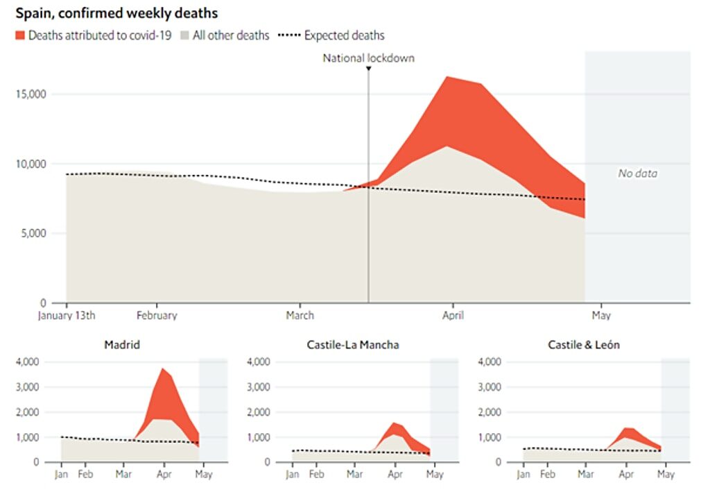
Here's The Economist's chart for Spain:
Note that most of the excess deaths came from the Madrid region.
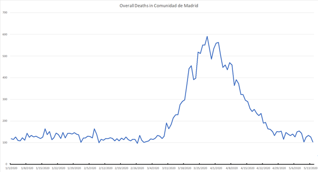
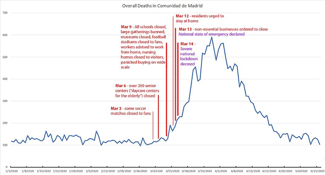
Here's a chart I made of overall mortality in the Madrid region using the same data The Economist used (available here). Notice the steep rise in deaths beginning around March 9th:
Now let's add the major lockdown orders to this chart:
Red text denotes lockdown orders limited to the Madrid region; purple text denotes lockdown orders affecting the entire nation. I compiled this information from news reports.
You will observe here the same peculiar phenomenon we've observed thus far: significant rises in mortality do not pre-date major lockdown events, but rather coincide with them, or follow them very closely.
Next up, Britain.
Britain
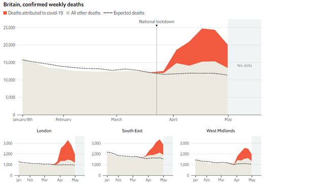
The Economist draws the "National lockdown" line on Mar 23. But again, that was only Phase 2 of the lockdown. Phase 1 began on March 20.
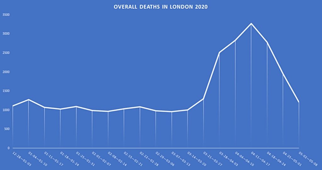
Many of the excess deaths occurred in London. Let's take a closer look at that data:
As you can see from this chart (created using The Economist's own data set), there was no significant increase in deaths before March 20, and no increase at all before March 13.
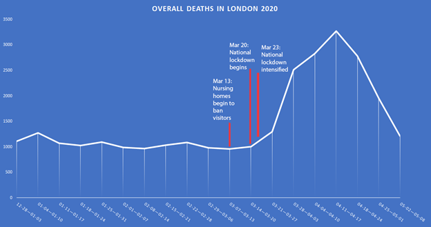
Now let's add the lockdown dates:
And we see the same phenomenon here as elsewhere — namely, no increase in overall mortality until after the lockdowns begin, and then a sudden, precipitous rise.
Italy
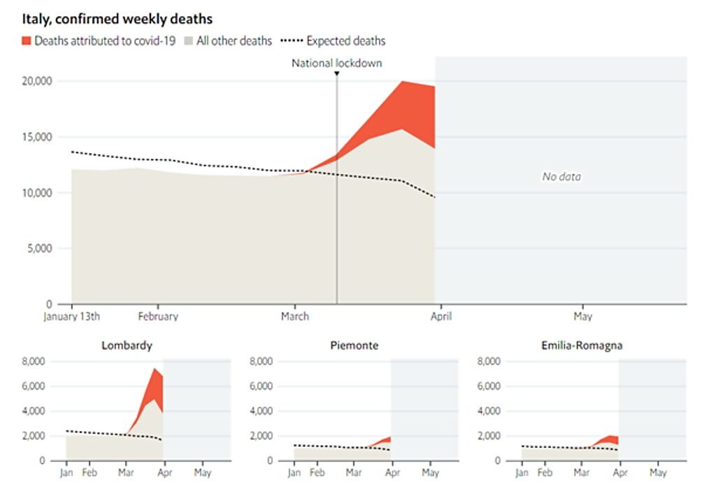
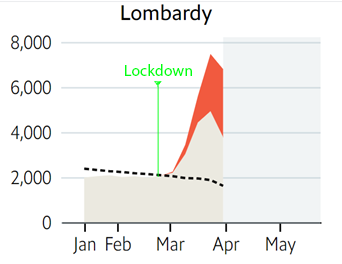
In Italy, the largest increase in deaths occurred in the Lombardy region. Let's look closer at that data, and also plot the regional lockdown on February 22.
Once again: the sudden, precipitous increase in deaths followed the lockdown.
France
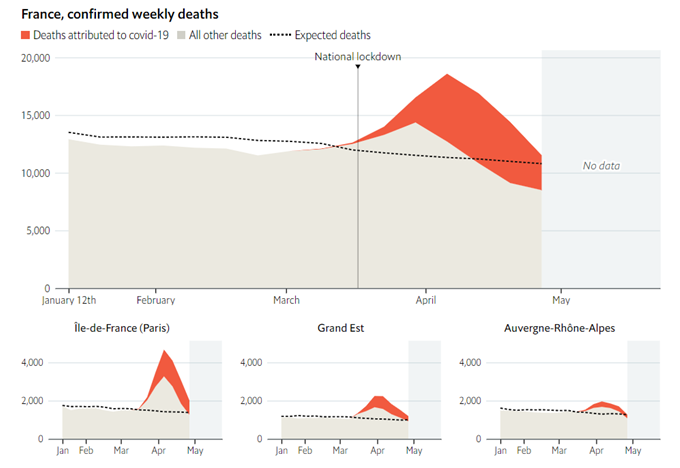
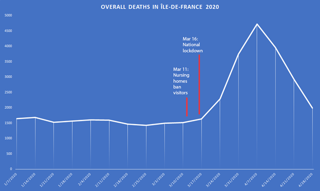
The greatest increase in deaths came from the Paris region, so let's take a closer look at that data:
Again, the same phenomenon is evident here as elsewhere: no significant increase in deaths until after the lockdown was declared, and then an immediate, precipitous rise.
New York City
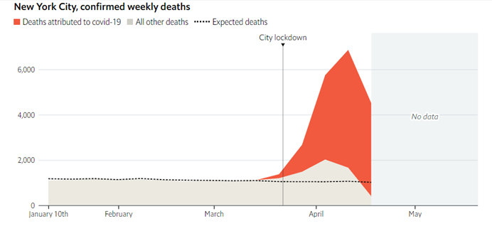
Here, the "City lockdown" is shown to have occurred on March 22.
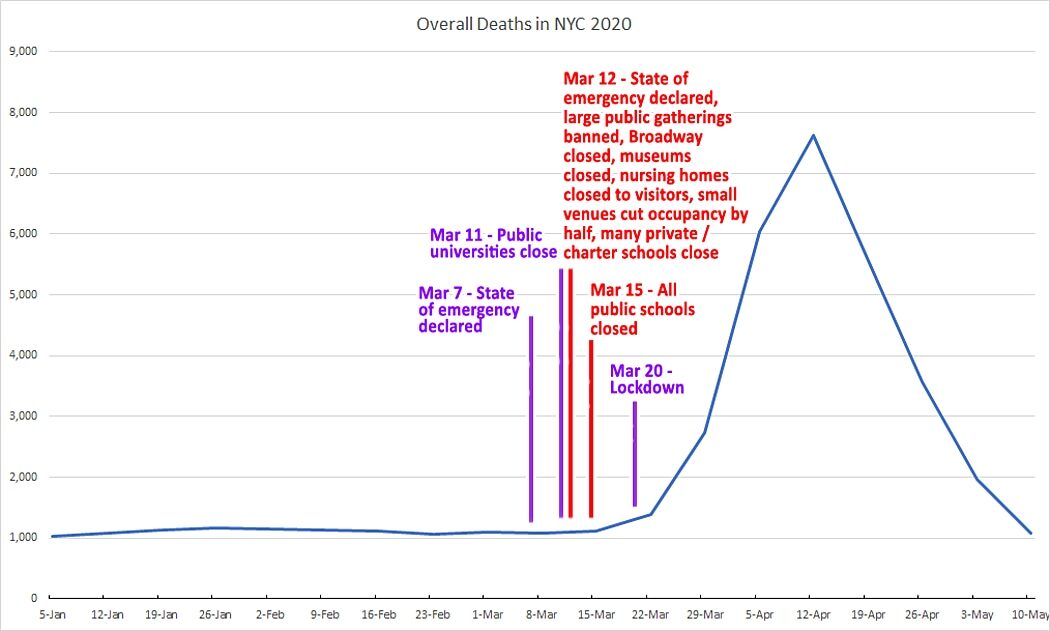
But let's take a closer look. Here is the same data overlaid with lockdown orders:
Purple text denotes state-level orders, red text city-level orders.
Now it's very clear: there was no increase in deaths before the start of lockdowns.
(Note: I plotted the state lockdown on Mar 20, which is when it was announced and went into partial effect.)
Let's take a look at one more case.
Ecuador
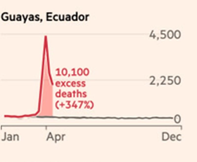
A severe national lockdown was decreed in Ecuador on March 16th, and went into effect on March 17th. The Guayas province, which contains Ecuador's most populous city, suffered the highest rate of overall mortality. Here's the mortality chart (from the Financial Times) for that region:
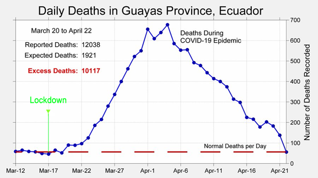
And here's a closer look:
Source
As with all the other cases we've examined here — and as with all the countries and cities for which we have good mortality data — only after the lockdown began was there a significant increase in deaths.
All this leads us to the following questions, which we pose to all those who continue to defend the use of lockdowns as an effective means to prevent excess deaths.
Q: Why was there no significant increase in overall mortality, in any country we have good data for, before the start of lockdowns?
Q: Why does a precise and exact correlation exist between the start of lockdowns and significant rises in overall mortality?
Or:
Q: How is it that governments in every country imposed lockdowns at precisely the same time relative to the future precipitous rise in their populations' overall mortality rate?
And:
Q: How is it, moreover, that this moment in time happened to fall immediately before that precipitous rise?
Most attempts to answer these questions would probably involve the assertion that the authorities in every country had some notion of the true prevalence of the virus at the beginning of the pandemic. But we know now that that was not really the case. In the early weeks and months of 2020, testing was extremely limited. This was based, partly, on the assumption that the virus was not yet widespread. As testing was systematically expanded, the number of positive results increased, and this increase was generally believed to correspond to the actual spread of the virus.
Now, posthumous testing has shown that the virus was circulating — and killing — weeks, or even months before it was initially detected in many countries. Other researchers are coming to the same conclusion; the prevalence of the virus was vastly underestimated at the beginning of the pandemic.
Which leads us to our final question:
Q: If health authorities vastly underestimated the prevalence of the virus at the beginning of the pandemic, why did the virus nevertheless wait until lockdowns were imposed to suddenly start killing at levels which exceeded normal deaths?



Kommentar: In short, they did the reverse of what they said the lockdowns were for: they spiked what would otherwise have been a 'normal, seasonal' curve by prematurely killing off hundreds of thousands of elderly and immune-compromised people.
See also: